When researching for this three part series, I was looking at Illuminated manuscript imagery mostly from the fourteenth and fifteenth centuries (though they were made for centuries before and after). Illuminated manuscripts were used as visual aids to the stories and lessons they accompanied. I decided to translate lyrics from beloved songs by Gillian Welch & David Rawlings into vibrant pictorial stories, leaning heavily on inspiration from images found in various versions of “The Book of Hours.” I’ve been dumbfounded to discover that as I comb through these ancient images and pair them up with the stories that GW&DR tell lyrically, the lessons start to fall in step with each other. Struggling with the concept of death, fear and poverty transcends every era of humanity and it’s been interesting to see the parallels when I plug their lyrics into the style and setting of a medieval manuscript.
In all the illuminated manuscript images I looked through, they cram every corner of the page chock full of mythical creatures, flowers and ornate patterns. The creatures are often whimsical, fearsome or mischievous and might represent some sort of side fable or moral reminder, but some of it seems absolutely nonsensical. It’s debatable what their true purpose was, (from what I read; some argue it’s a reminder that hell awaits, some argue that they’re pagan symbols that were lumped in with early christianity and some say they ward off “evil spirits” or some combination of the three) but based on what a blast it is to draw the little made up creatures, I kind of suspect it was fun for them too and I like to think that they were possibly tired of their heavy assignments; constantly warning people of the dangers of sin and death - and I think might’ve worked in a way to enjoy themselves. (but also, they were obsessed with symbolism, so I’m wrong and it probably means something but I wasn’t able to become a comprehensive scholar of the Middle Ages in 4 months)
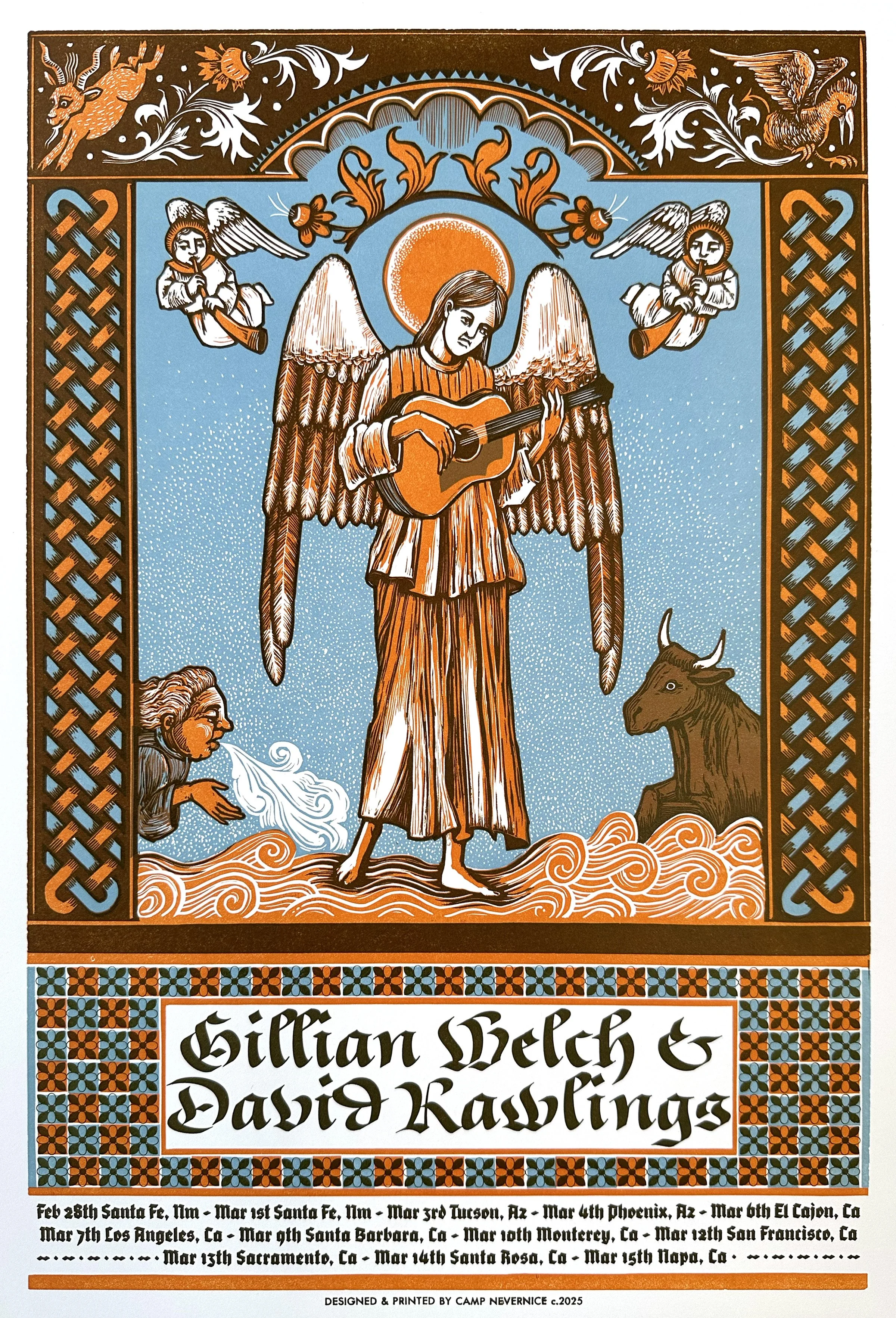
In “Red Clay Halo” she can’t escape the telltale signs of her poor country upbringing, the red clay stains will follow her everywhere, even past the gates of heaven. It was easy to picture her as the patron saint of the Appalachian girl. I pulled borders and creatures from other illuminated manuscripts I found that had a similar theme.
(*Based on my interpretation of “Red Clay Halo” written by Gillian Welch & David Rawlings and featured on the album “Time (The Revelator)” released in 2001)
12 ¾ in x 18 ¾ in
Limited edition original poster, hand carved and printed on a Vandercook proofing press in Nashville, TN
This was the poster sold at the shows on the west coast leg of the Woodland Tour February and March, 2025.
Linocut reduction, 2 blocks, 3 colors. Copyright Camp Nevernice 2025.
When researching for this three part series, I was looking at Illuminated manuscript imagery mostly from the fourteenth and fifteenth centuries (though they were made for centuries before and after). Illuminated manuscripts were used as visual aids to the stories and lessons they accompanied. I decided to translate lyrics from beloved songs by Gillian Welch & David Rawlings into vibrant pictorial stories, leaning heavily on inspiration from images found in various versions of “The Book of Hours.” I’ve been dumbfounded to discover that as I comb through these ancient images and pair them up with the stories that GW&DR tell lyrically, the lessons start to fall in step with each other. Struggling with the concept of death, fear and poverty transcends every era of humanity and it’s been interesting to see the parallels when I plug their lyrics into the style and setting of a medieval manuscript.
In all the illuminated manuscript images I looked through, they cram every corner of the page chock full of mythical creatures, flowers and ornate patterns. The creatures are often whimsical, fearsome or mischievous and might represent some sort of side fable or moral reminder, but some of it seems absolutely nonsensical. It’s debatable what their true purpose was, (from what I read; some argue it’s a reminder that hell awaits, some argue that they’re pagan symbols that were lumped in with early christianity and some say they ward off “evil spirits” or some combination of the three) but based on what a blast it is to draw the little made up creatures, I kind of suspect it was fun for them too and I like to think that they were possibly tired of their heavy assignments; constantly warning people of the dangers of sin and death - and I think might’ve worked in a way to enjoy themselves.
“Cumberland Gap” begins with a farewell from a boy to his mother as he’s gone for old Kentucky. The lyrics continue on to paint a picture of the ways a person could test their fate in that “devil of a gap” when taking Daniel Boone’s Wilderness Road from Virginia west into Tennessee and Kentucky. Settlers often starved, froze to death, or were ambushed easily by the justifiably angry Shawnee and Chickamauga who refused to sign the treaty and relinquish the land. It sounds like you were more likely to die crossing into Kentucky in the 1770’s than you were to survive. In this medieval rendering - I portrayed the boy as a young bard, singing of his worries as he walks through the pass on foot. The demons symbolically represent the peril he faces. While my versions seem more impish than hostile, I was trying my best to capture the sinister twin versions that appear in illuminated manuscripts spanning from 1300-1500. (In other words, there really is a devil character with possums for thighs and chickens’ feet. See: “Roundel with Souls Tormented in Hell” Dieric Bouts workshop). Apparently, images of hell and torment were very popular to hang in their bedrooms. People wanted reminders of the “transience of worldly existence as preparation for eternal life after death.” (Mirror of the Medieval World, The Metropolitan Museum of Art) Who knew early religion was so metal?
(*Based on my interpretation of “Cumberland Gap” written by David Rawlings & Gillian Welch and featured on the album “Poor David’s Almanack” released in 2017).
12 ¾ in x 18 ¾ in
Limited edition original poster, hand carved and printed on a Vandercook proofing press in Nashville, TN
Linocut reduction, 3 blocks, 4 colors. Copyright Camp Nevernice 2025.
When researching for this three part series, I was looking at Illuminated manuscript imagery mostly from the fourteenth and fifteenth centuries (though they were made for centuries before and after). Illuminated manuscripts were used as visual aids to the stories and lessons they accompanied. I decided to translate lyrics from beloved songs by Gillian Welch & David Rawlings into vibrant pictorial stories, leaning heavily on inspiration from images found in various versions of “The Book of Hours.” I’ve been dumbfounded to discover that as I comb through these ancient images and pair them up with the stories that GW&DR tell lyrically, the lessons start to fall in step with each other. Struggling with the concept of death, fear and poverty transcends every era of humanity and it’s been interesting to see the parallels when I plug their lyrics into the style and setting of a medieval manuscript.
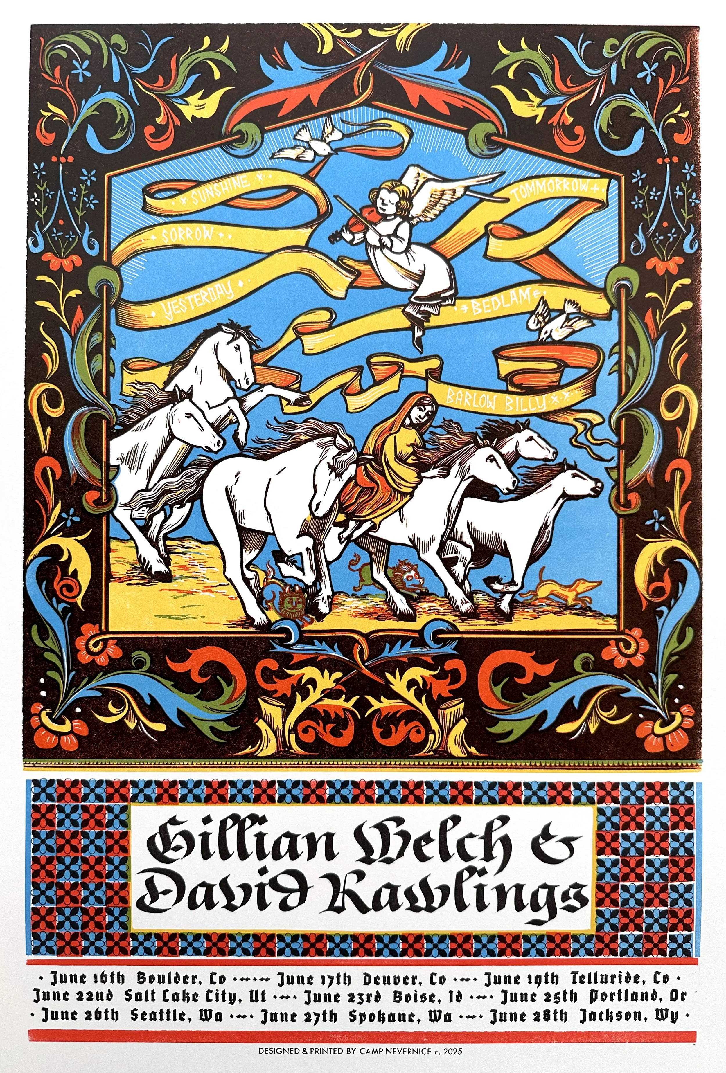
“Six White Horses” describes death coming in the form of six white horses named Sunshine, Sorrow, Yesterday, Tomorrow, Bedlam & Barlow Billy. Picking this particular song to create an illuminated manuscript for may have been the most fitting, although I couldn’t really make a sellable poster with the way they would’ve probably portrayed the dying mother in the 1300’s. Death was a common theme in all the different versions of the Book of Hours. Often there would be an image of a dying person in bed (or a wrapped corpse in a grave) closely encircled by a nursemaid or physician, a priest of some sort and presumably loving family followed by the presence of beings from the supernatural world - angels, Mary, the disciples, God but also death - portrayed often by a half rotten skeleton with a lance, coming to escort your mortal body into the eternal afterlife. Sometimes the skeleton would be riding a horse, sometimes the skeleton would be portrayed inflicting the blow - one image I saw had death tripping a man with his lance, causing him to stumble into the water and drown. There were also the inclusion of the beasts, sometimes hiding under the bed — which I thought were demons; and in some cases they might’ve been a reminder to live a devout, honorable life etc etc — but more often, the creatures were meant to ward off evil, like otherworldly guard dogs scary enough to spook the devil and protect your soul. For my interpretation, rather than make the poster have a bedridden corpse, I opted to portray the dying mother in a positive light - riding atop her kind but deathly escorts, with her beastly protectors running alongside and the angels heralding her departure with a fiddle tune.
(*Based on my interpretation of “Six White Horses” written by Gillian Welch & David Rawlings and featured on the album “The Harrow & The Harvest” released in 2011).
12 ¾ in x 18 ¾ in
Limited edition original poster, hand carved and printed on a Vandercook proofing press in Nashville, TN
Linocut reduction, 3 blocks, 4 colors. Copyright Camp Nevernice 2025.
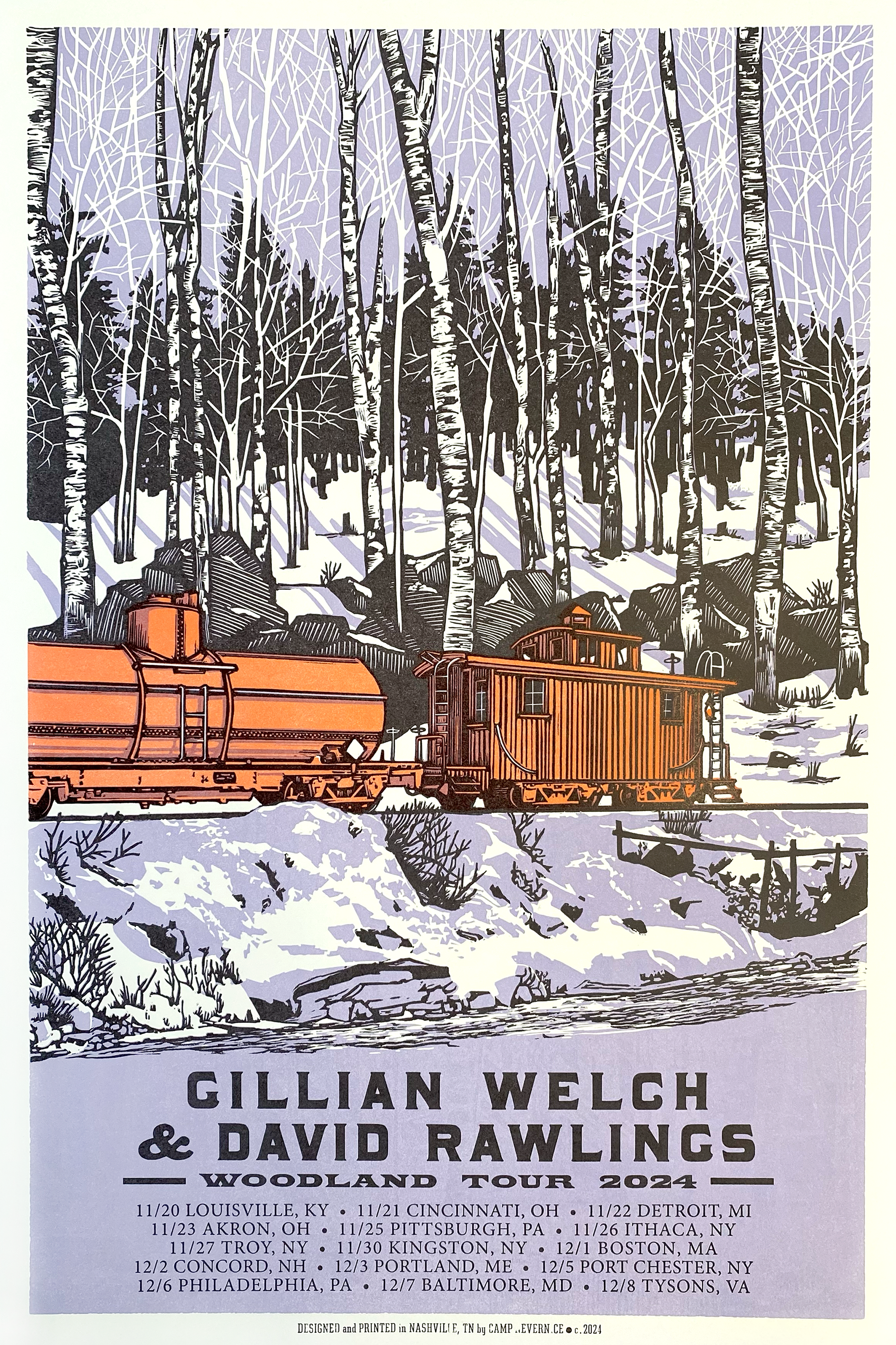
Posters featuring a Cecropia moth for Gillian Welch and David Rawlings during their Woodland Tour specifically for the sold out shows at Haw River Ballroom on October 23, 24 and 25th, 2025 in Saxapahaw, NC. Designed, illustrated and produced by Laura Baisden at Camp Nevernice in 2024. All images are hand carved from linoleum and block printed one layer at a time. The words are printed using handset antique wood and metal type.
12×18 printed on acid free Cougar Natural paper
Posters commissioned by Jason Isbell and the 400 Unit in Lawrence, KS. The original date was January 18, 2024, but due to health issues they had to reschedule last minute. Unfortunately the posters were already printed and because the destructive nature of the reduction carving process, reprinting wasn’t possible — so we took the finished posters and ran one more pass with the new rescheduled date: May 7, 2024 thus making these posters especially unique. The artwork features a floral pattern inspired by Russian folk are and was designed, illustrated and produced by Laura Baisden at Camp Nevernice in 2024. All images are hand carved from linoleum and block printed one layer at a time. The words are printed using handset antique wood and metal type.
11 7/8 × 18 in printed on acid free Cougar Natural paper
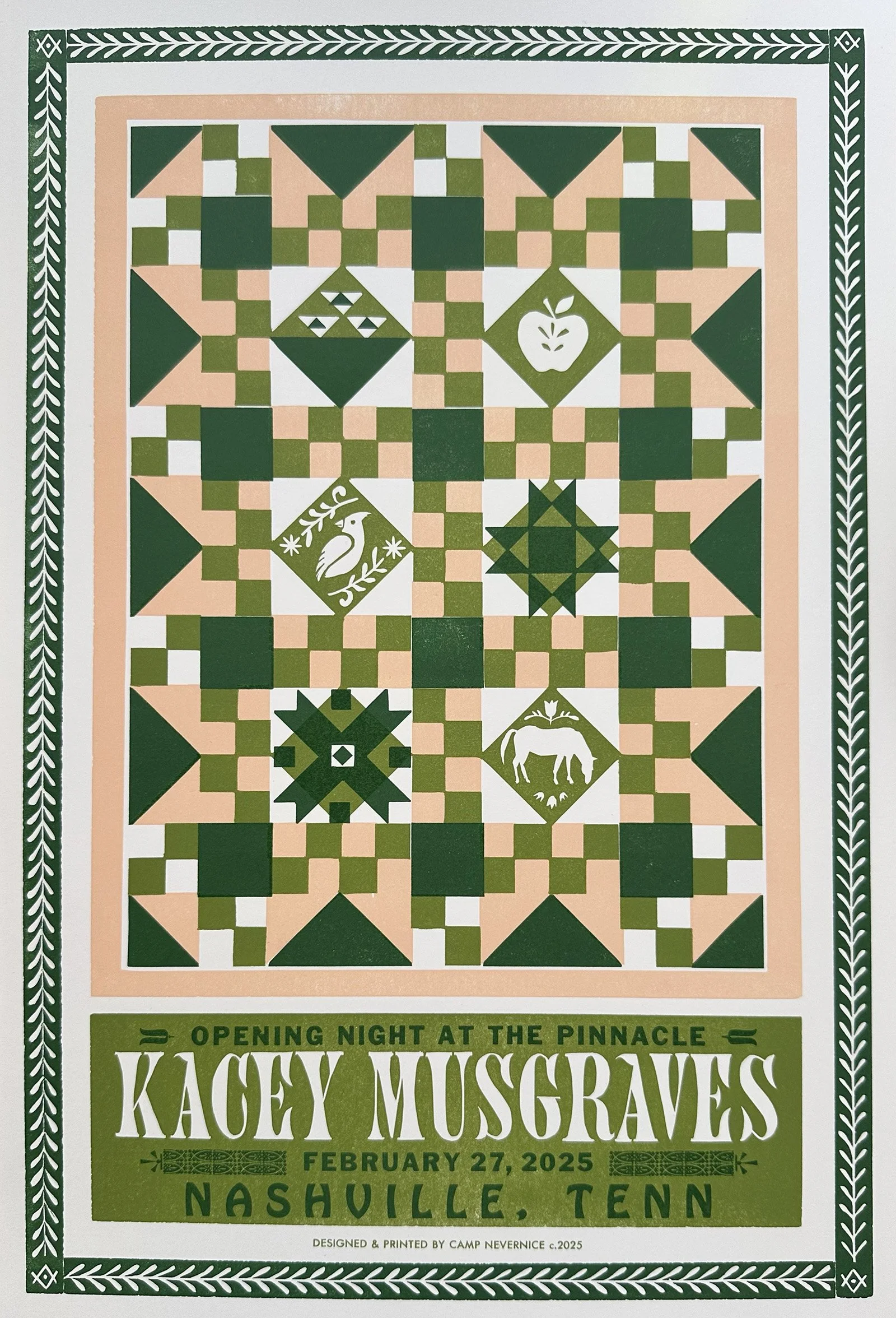
Posters commissioned by Jason Isbell and the 400 Unit in Auburn, AL on June 10, 2024 featuring a classic star quilt pattern designed, illustrated and produced by Laura Baisden at Camp Nevernice in 2024. All images are hand carved from linoleum and block printed one layer at a time. The words are printed using handset antique wood and metal type.
10.5 × 18.75 in printed on acid free Cougar Natural paper
Posters commissioned for the Maren Morris and Joy Oladokun benefit show for Camp Wayfarer at The Basement East in Nashville Tennessee on April 2, 2024 — designed, illustrated and produced by Laura Baisden at Camp Nevernice in 2024. All images are hand carved from linoleum and block printed one layer at a time. The words are printed using handset antique wood and metal type.
12.5 × 18.75 printed on acid free Cougar Natural paper
Posters commissioned by Maren Morris for her RSVP Redux Tour and designed, illustrated and produced by Laura Baisden at Camp Nevernice in 2024. All images are hand carved from linoleum and block printed one layer at a time. The words are printed using handset antique wood and metal type.
12 5/8 × 18 7/8 in printed on acid free Cougar Natural paper
Limited edition poster designed especially for Jason Isbell and the 400 Unit at their New Orleans, Louisiana show on September 15, 2023 at the Orpheum Theater with Lonnie Holley opening.
Posters commissioned by Jason Isbell and the 400 Unit with SG Goodman in Salem, VA on August 9, 2023 and featuring a sparrow designed, illustrated and produced by Laura Baisden at Camp Nevernice in 2023. All images are hand carved from linoleum and block printed one layer at a time. The words are printed using handset antique wood and metal type.
11 5/8 × 18 ¾ in printed on acid free Cougar Natural paper
Limited edition poster designed especially for Jason Isbell and the 400 Unit at their Shreveport, Louisiana show on September 14, 2023 at the Shreveport Municipal Auditorium with Lonnie Holley opening.
Posters commissioned by the artists and designed, illustrated and produced by Laura Baisden at Camp Nevernice in 2022. All images are hand carved from linoleum and block printed one layer at a time. The words are printed using handset antique wood and metal type.
12 ½ x 18 7/8 printed on acid free Cougar Natural paper
Posters commissioned by Jason Isbell and the 400 Unit for their show in Evans, GA on June 7, 2024 featuring a classic start quilt pattern designed, illustrated and produced by Laura Baisden at Camp Nevernice in 2024. All images are hand carved from linoleum and block printed one layer at a time. The words are printed using handset antique wood and metal type.
10.5 × 18.75 in printed on acid free Cougar Natural paper
Posters commissioned by Hayes Carll for his Grateful for Christmas Tour with Melissa Carper featuring nostalgic holiday ornaments — designed, illustrated and produced by Laura Baisden at Camp Nevernice in 2023. All images are hand carved from linoleum and block printed one layer at a time. The words are printed using handset antique wood and metal type.
12.75 × 19 printed on acid free Cougar Natural paper
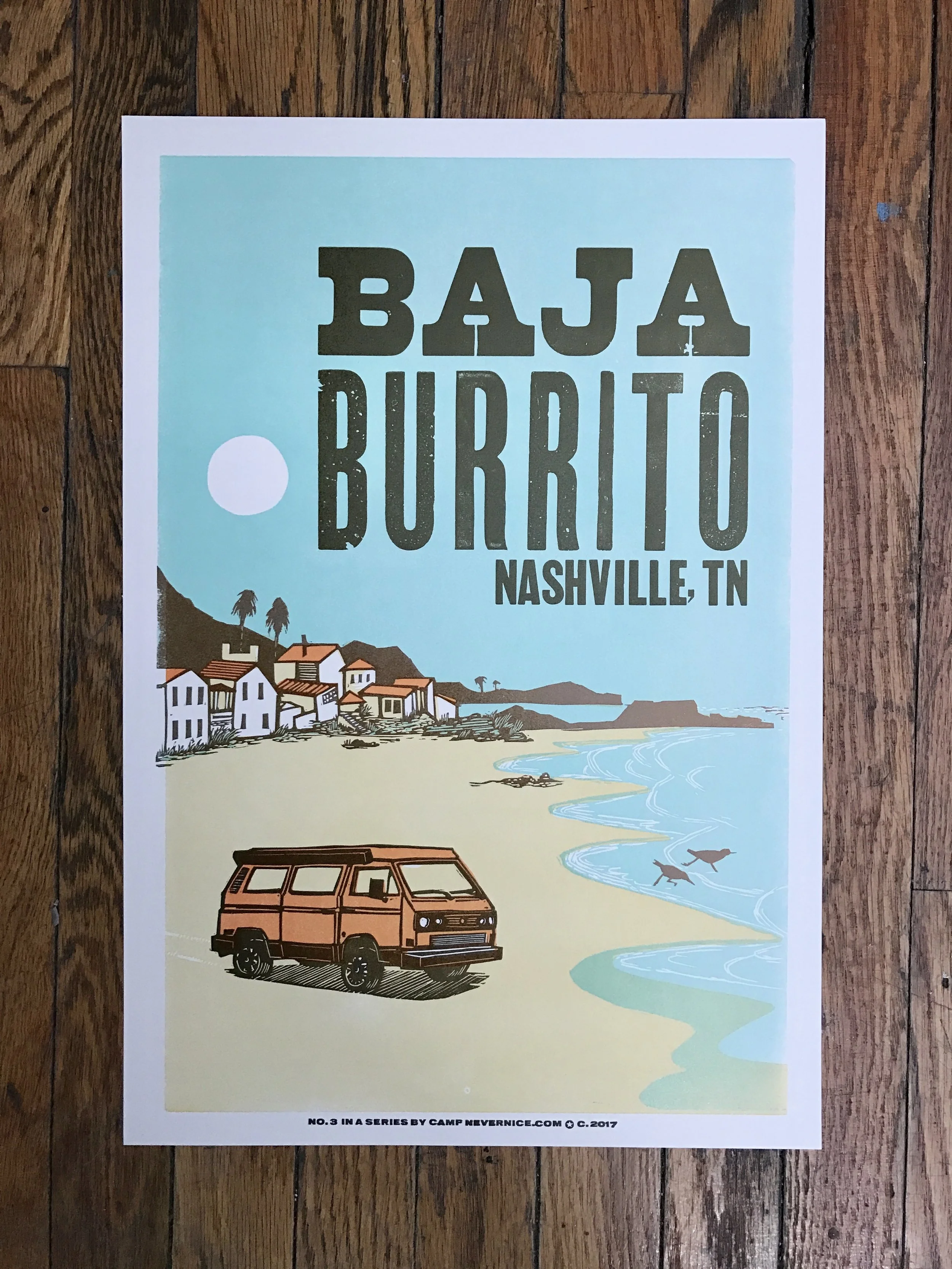
We’ve been doing a special series of Baja Burrito posters for the last seven years! This is No. 7 in the series - made for the 2023 summer season.
Letterpress posters commissioned for Brandi Carlile’s appearance on Austin City Limits Season 48, Live at The Moody Theater on July 13, 2022.
Featuring a hand-carved linoblock reduction and antique wood and metal type. This is a signed, limited edition of 300. We are selling numbers 251-298 of 300 from the edition.
12.75”x18.75” on acid free, 100 lb natural off white cover paper
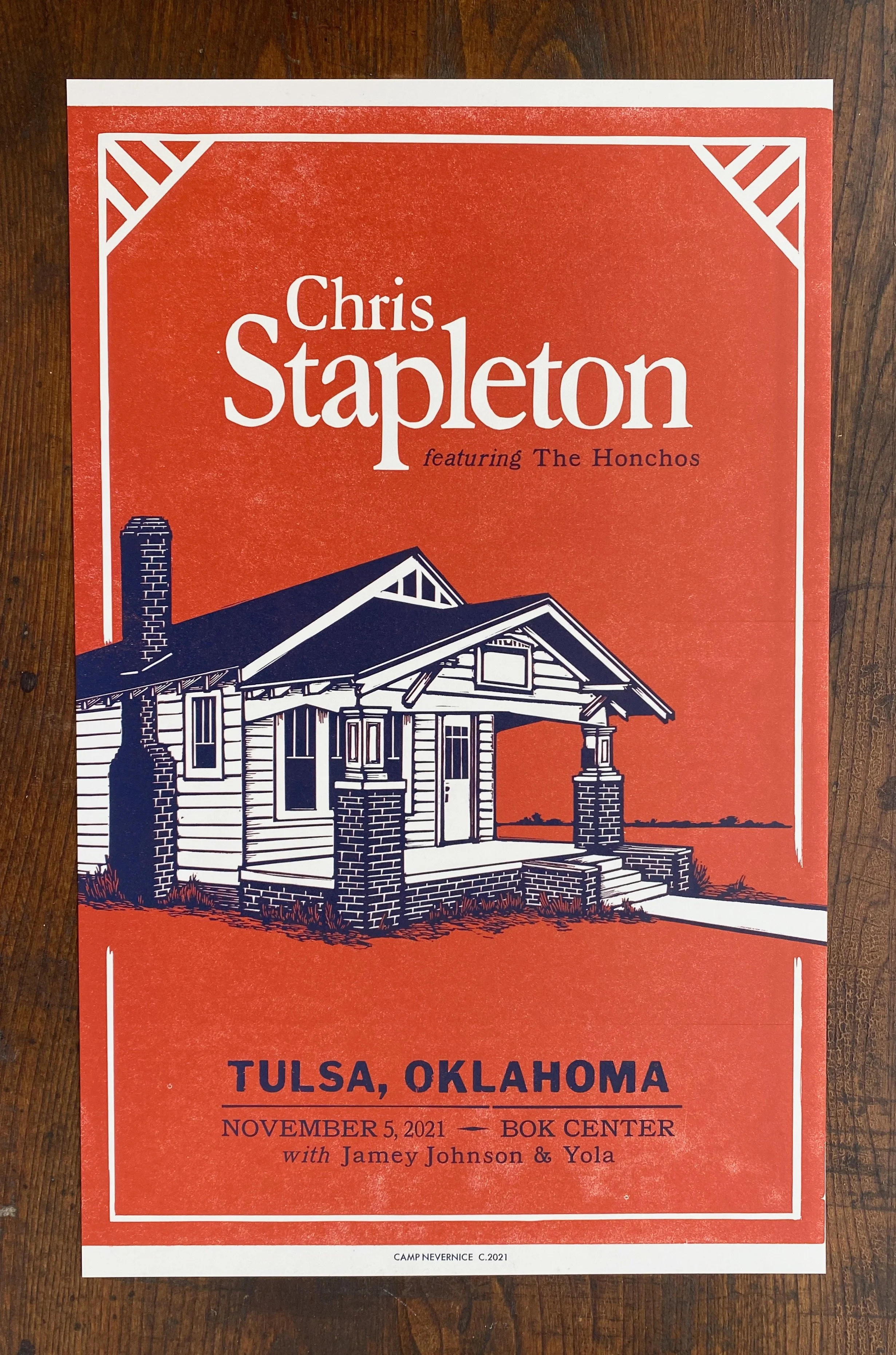
Poster for Chris Stapleton’s show in Tulsa, Oklahoma on November 5, 2021 featuring the house from The Outsiders.
Original poster designed for Eric Church’s show at Smoothie King Center on April 9, 2022 during the Gather Again Tour. This alligator image was created by pressing a hand carved linoleum block into paper (with ink in between), one layer at a time. The block itself was a reduction carving; meaning the linoleum was carved progressively throughout the edition and can never be re-printed. The text is printed from a combination of antique wood and metal type, printed on the same press, using the same relief process. There are two versions of this print - all were printed simultaneously by cleaning the ink off the block and changing both the ink and the paper stock mid-run. The green ink on off white paper is the version sold at the show; brown ink on Kraft paper was the variant created for the fan club members.
18.5”x12.5”
The fifth poster (out of six) for a series commissioned by Gillian Welch for her 2018 Tour featuring her ‘65 Chevy Impala.
Gillian Welch and Acony Records hired us to make a series of posters featuring her beloved ‘65 Chevy Impala driving cross country for her 2018 tour. Each poster in this series highlights some features of the neck of the woods she’s touring in. Here, she was in Arizona, Nevada and southern California so it made sense to have the car driving into a field of cacti with the Sierra Nevada mountains looming off in the distance.
Posters commissioned by Chris Stapleton featuring the Honchos with Jamey Johnson and Yola in Corpus Christi, TX on March 11, 2020. Designed, illustrated and produced by Laura Baisden at Camp Nevernice in 2020. All images are hand carved from linoleum and block printed one layer at a time. The words are printed using handset antique wood and metal type.
*Featured in the Country Music Hall of Fame
13×19 printed on acid free Cougar Natural paper
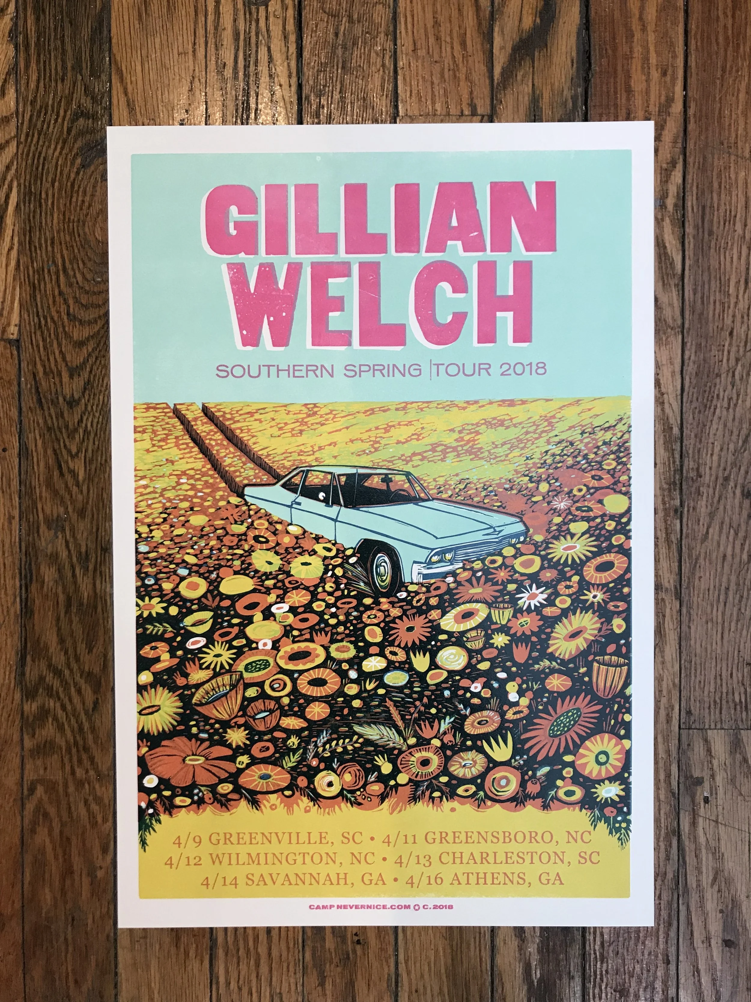
Gillian Welch and Acony Records hired us to make a series of posters featuring her beloved ‘65 Chevy Impala driving cross country for her 2018 tour. Each poster in this series highlights some features of the neck of the woods she’s touring in. Here, she was touring through the South East at the height of spring. Thus, the car is depicted careening through a field of bright flowers.
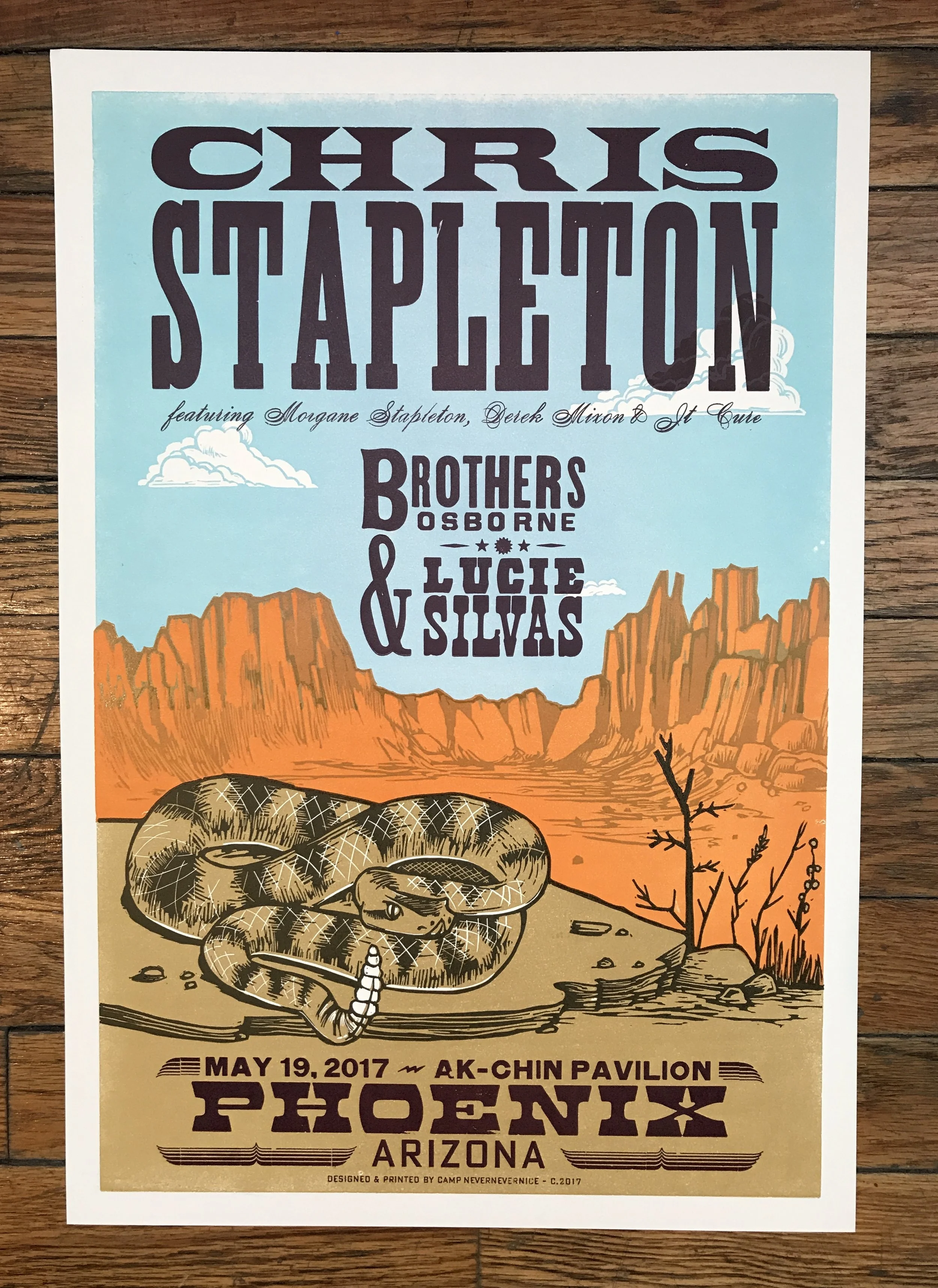
A poster for Chris Stapleton's show at Ak-Chin Pavilion in Phoenix, AZ. Limited edition of 150. Commissioned by Chris Stapleton via Red Star Merchandising in Charlottesville, VA.
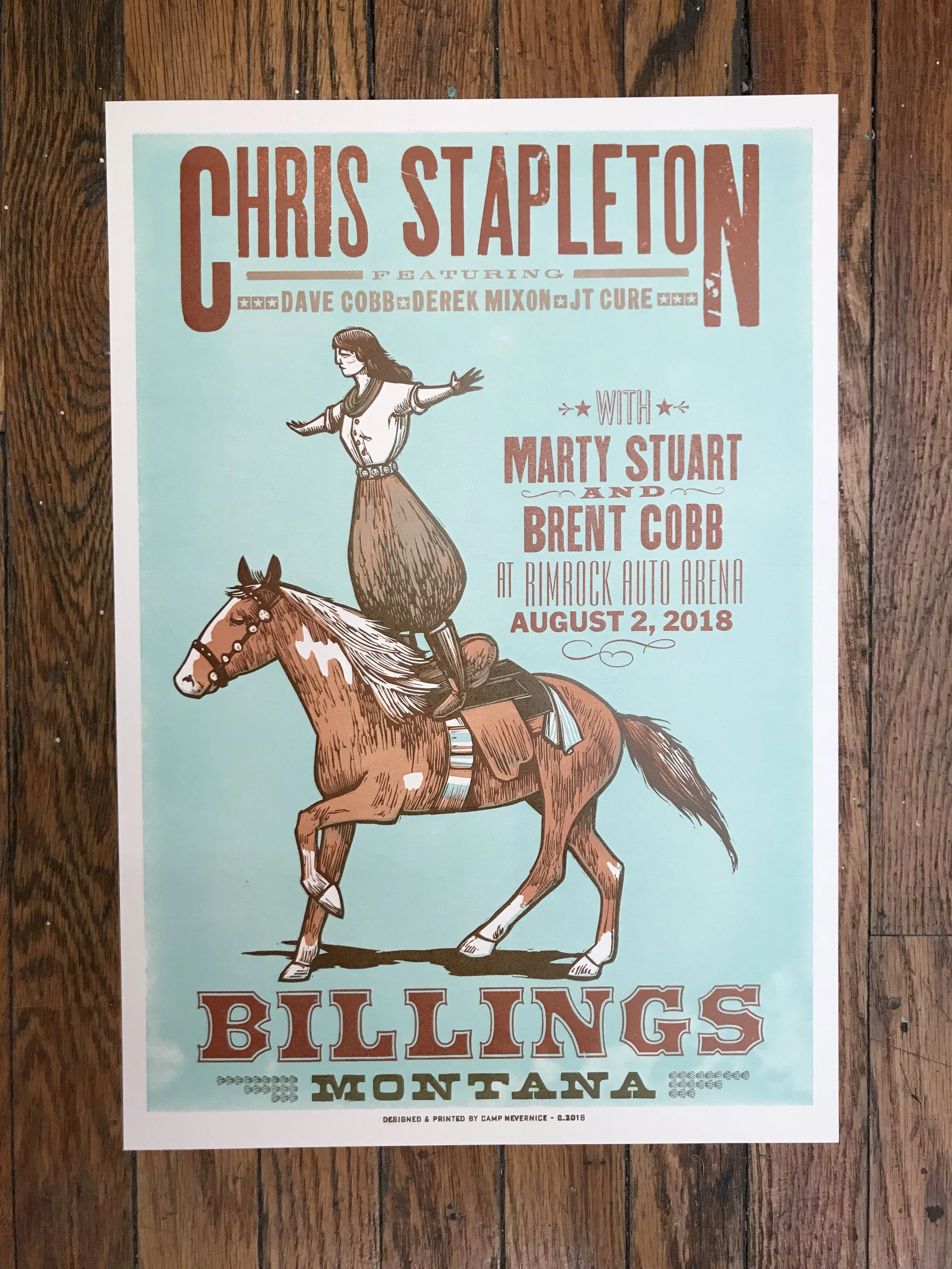
This poster for Chris Stapleton in Billings, MT features a trick rider cowgirl from the early 1900’s. The image was hand-carved from linoleum and it was commissioned by Chris Stapleton via Red Star Merchandising in Charlottesville, VA. Limited edition of 150.
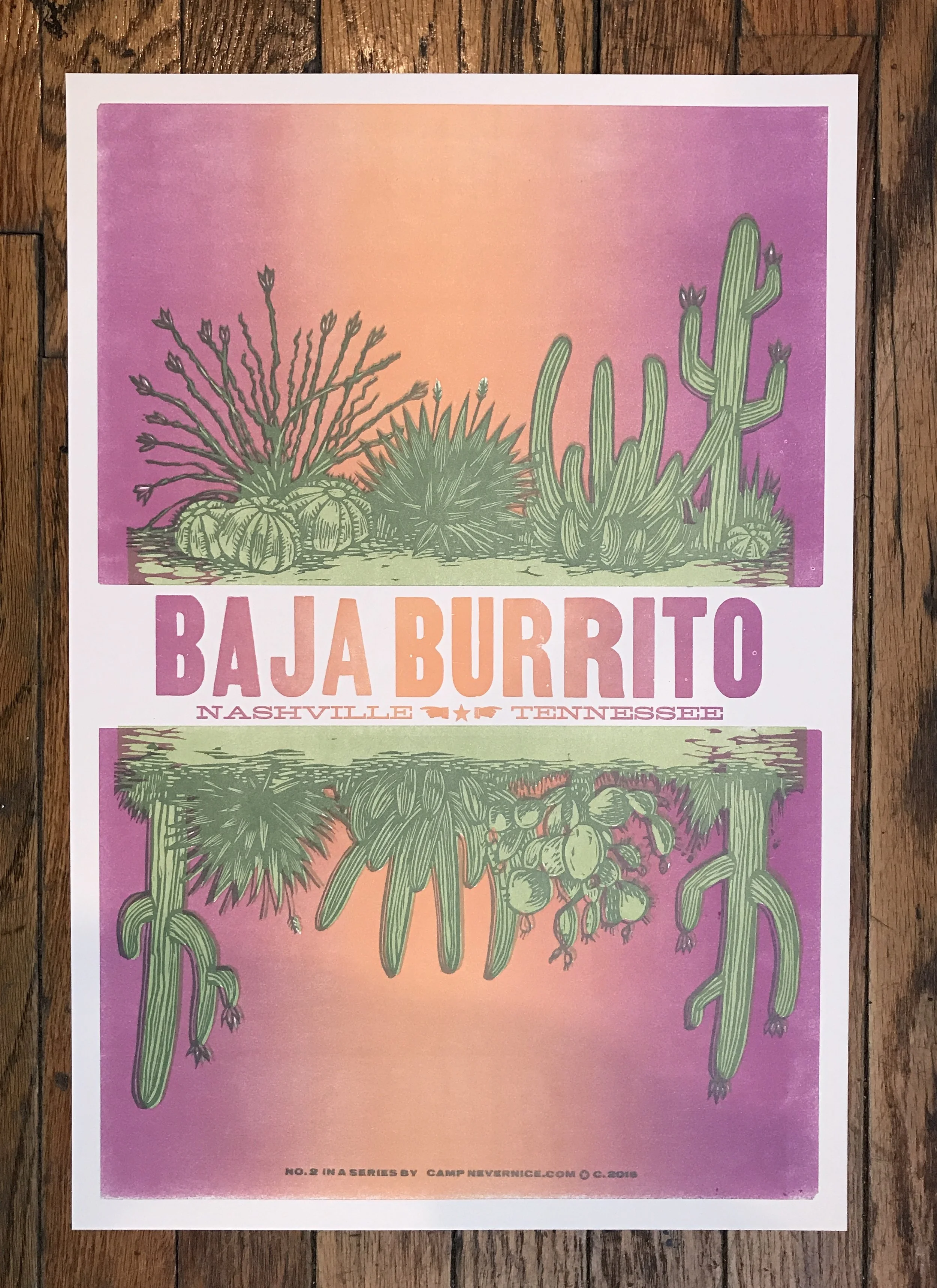
No. 2 in a series created for Baja Burrito in Nashville, TN.
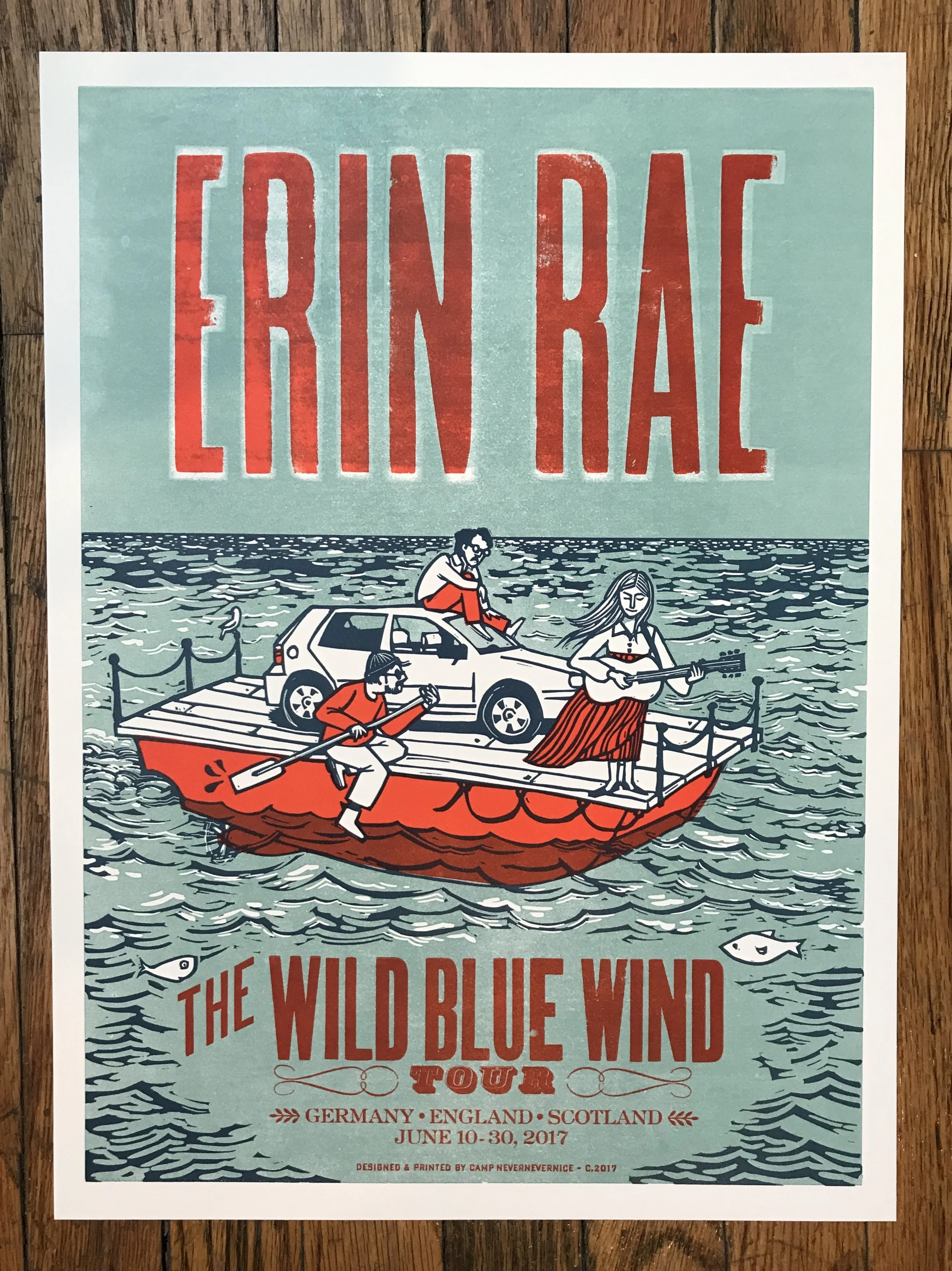
3 color Poster, designed for Erin Rae's 2017 European Tour.
Features the two other members of her touring band sailing across the sea with her old Volkswagen Golf (RIP).
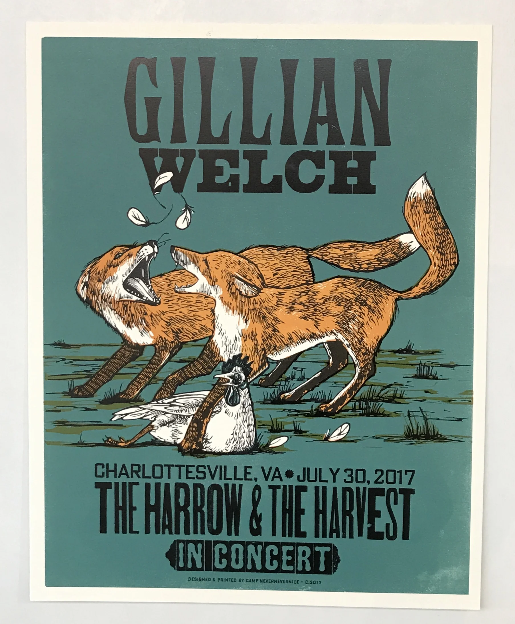
I printed a series of posters for Gillian Welch's east and west coast tours featuring these two foxes fighting over a chicken. Each city on the tour had a different background color. The image was inspired by Jean Baptiste Marie Huet's painting called "Fox in a Chicken Yard" from 1766.
14.5"x18.5"
No. 3 in a Series created for Baja Burrito in Nashville, TN.
This was the poster created for Josh Ritter's album release of Sermon on the Rocks in the Fall of 2015 and was the first official “Camp Nevernice” print. We made a limited run of posters for each of the record stores that had early releases of the album.
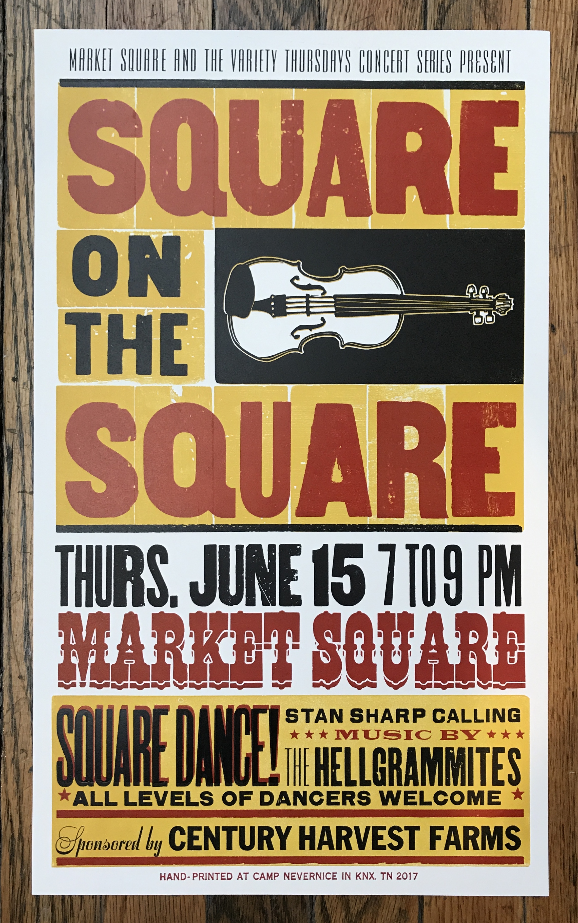
Market Square in Knoxville, TN hosts live music every Thursday night throughout the summer. This poster promoted a night that they sponsored a community square dance with a live string band and caller.
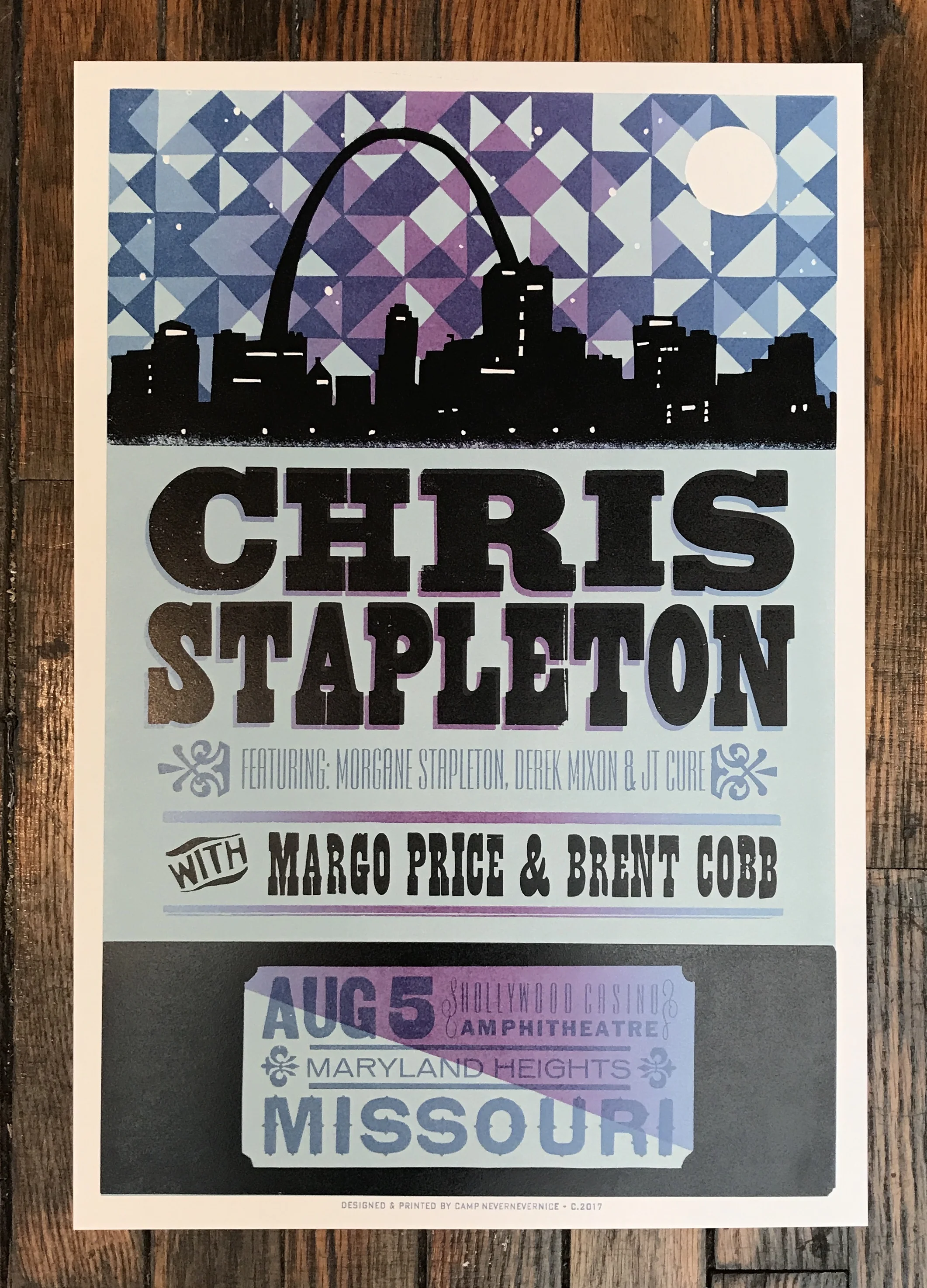
A poster for Chris Stapleton's show at Hollywood Casino in Maryland Heights, MO. Limited edition of 150. Commissioned by Chris Stapleton via Red Star Merchandising in Charlottesville, VA.
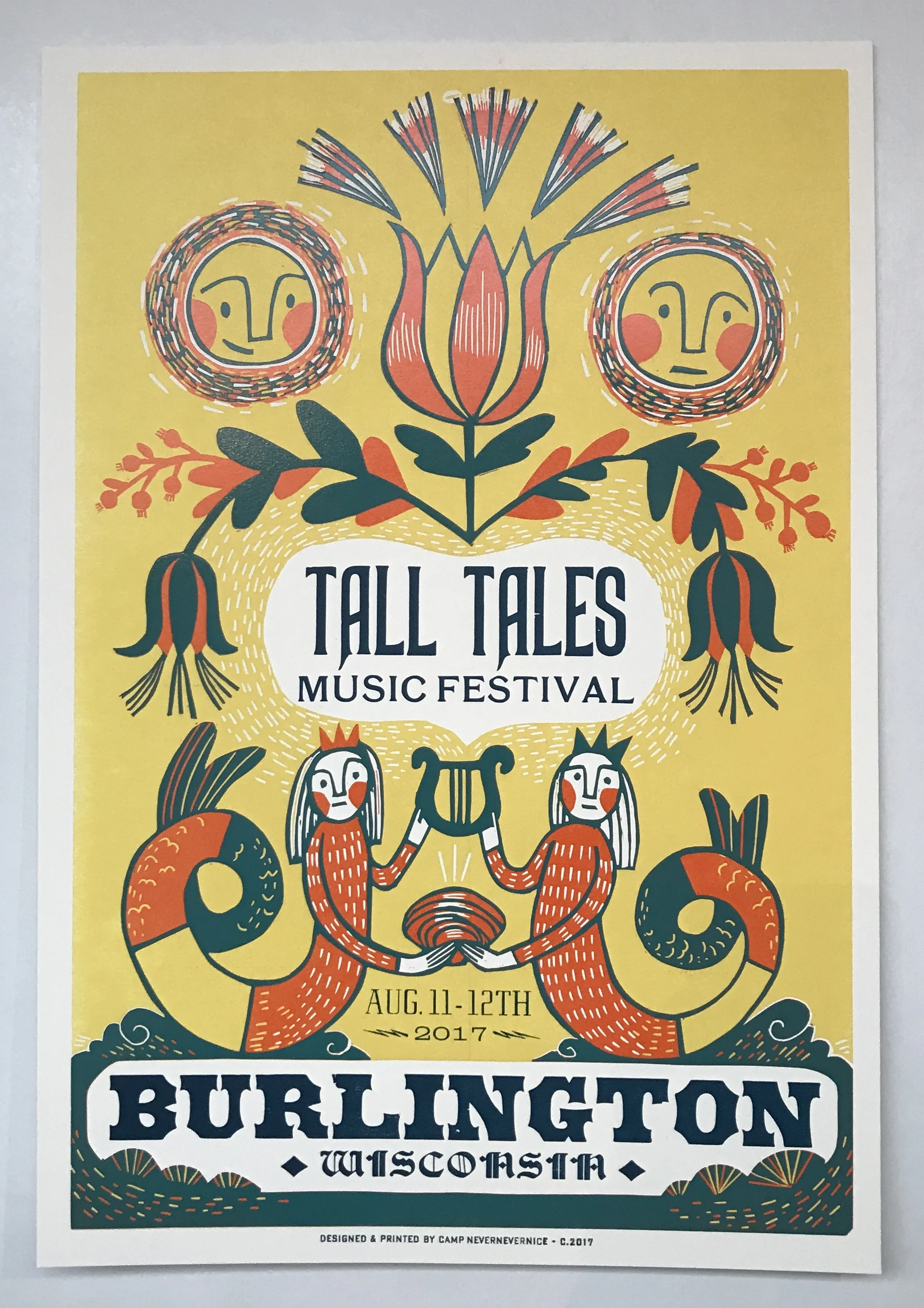
Historic downtown Burlington, Wisconsin hosts a music festival every year. This poster was made to reflect the fantastical and imaginative spirit of the Tall Tales Music festival, but also the rich history of the town. I was inspired by 1800's German folk art, and the way they depicted people and often incorporated tulips and flower borders.
Limited edition of 100.
Carolina Chocolate Drops played New Years' Eve at the Ryman Auditorium as the opening band for Old Crow Medicine Show. This poster was sold at that show.
Acony Records contacted me about doing a series of posters that were all connected to encourage folks to collect the whole set. It seemed logical that I continue the neighborhood series that I'd started years ago for this project. All of the shows took place in Tennessee, North Carolina, Virginia and Georgia--- Neighbors.
Poster design for The Mavericks at their show in Philadelphia at the Fillmore.
4 color reduction linocut with letterpress type.
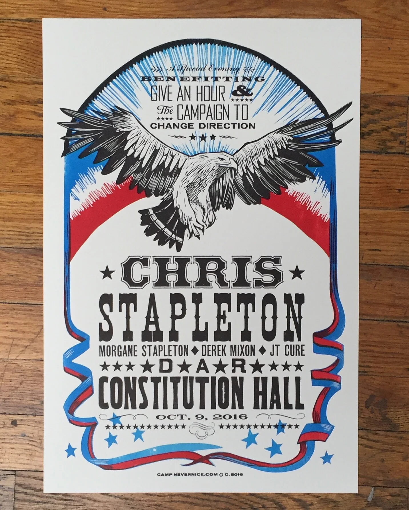
A poster for a Chris Stapleton concert at the DAR Constitution Hall in Washington, DC benefitting Give an Hour and The Campaign to Change Direction.
A poster designed for Aoife O'Donovan and Willie Watson's Fall tour 2016. Commissioned by Acony Records.
3 Colors, reduction carving.
Poster for Josh Ritter's Fall Tour 2016.
3 Color Linocut Reduction with Letterpress Type
A poster commissioned for Jared Lostracco. It was used to advertise his new single, and provide album cover design.
2 colors, linocut and letterpress type
JP Harris commissioned this poster for their show at Exit/In in Nashville, TN. I had to do it pretty dang quick (the night before), so it's just one color- carved out of Sentra board (the words) and linoleum (the car).
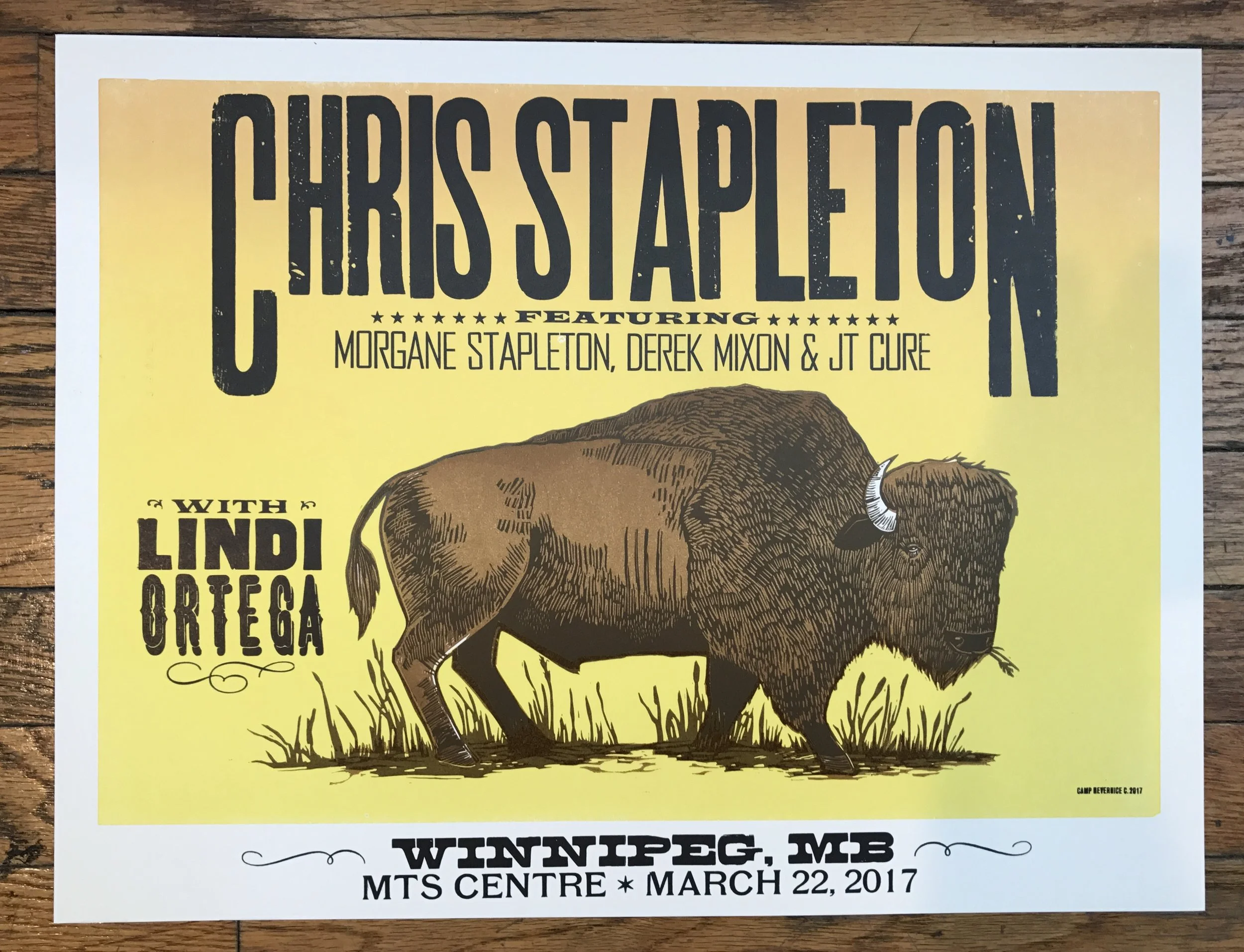
A poster for Chris Stapleton's show at the MTS Centre in Winnipeg, MB. Limited edition of 150. Commissioned by Chris Stapleton via Red Star Merchandising in Charlottesville, VA.
This was used as a book-cover as well as a promotional poster designed for CM Chapman's book: Music & Blood.
3 colors, Pressure printed wood blocks and letterpress type.
One of the most ridiculously fun projects to work on....
Spam has a food truck that tours all over the countryside, usually pairing up with big festivals and fairs. They hire artists from each city to make a poster commemorating their visit. For Nashville, they came into town for CMA Fest and asked if I would design a poster that captured the vibe of Nashville. I don't know if I succeeded in capturing the vibe per say, but I definitely got one small aspect of it right. I love the farm dances that happen just outside of town every so often. There's a string band playing tunes while someone volunteers to call the dances and generally speaking, there's usually a potluck involved. It's one of my favorite things that happens in Nashville and I decided to pitch it to the Spam folks and they loved it! So, here's my version of a Bell's Bend Farm dance, farm cats and all.
Screen printed by Ryan Nole at Kangaroo Press
The Bluebird Cafe hosts a summer music series at Vanderbilt Dyer Observatory through the summer called Songwriters Under the Stars. I did this poster for their 2016 concert series.
3 colors, woodcut, laser engraving and letterpress type
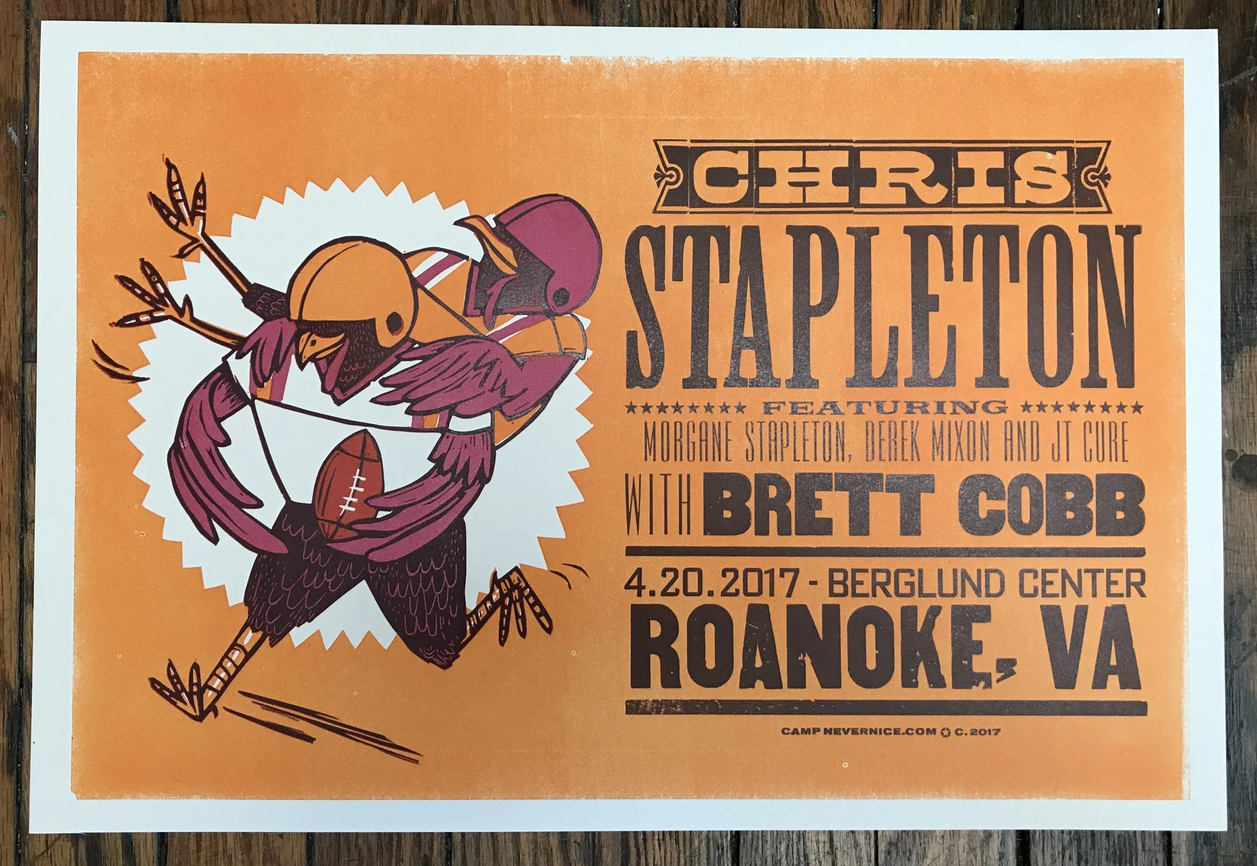
A poster for Chris Stapleton's show at Berglund Center in Roanoke, VA. Limited edition of 150. There was a specific request for Hokies, commissioned by Chris Stapleton via Red Star Merchandising in Charlottesville, VA.
Two little mallards floating in a lake.
5 Colors, 3 blocks
Limited edition reduction linocut
13”x19”
Number 5 in a series of prints commissioned by Baja Burrito, a local favorite restaurant in Nashville. Every year, the owner commissions a print and all the sales go to charity.
This particular poster features various bright tropical flowers, loosely inspired by the flowers that grow in the Baja region.
Limited edition of hand-carved linocut reduction prints.
5 colors, 2 blocks